Avenir Pairings
Brand fonts
Behind the Font
Creative
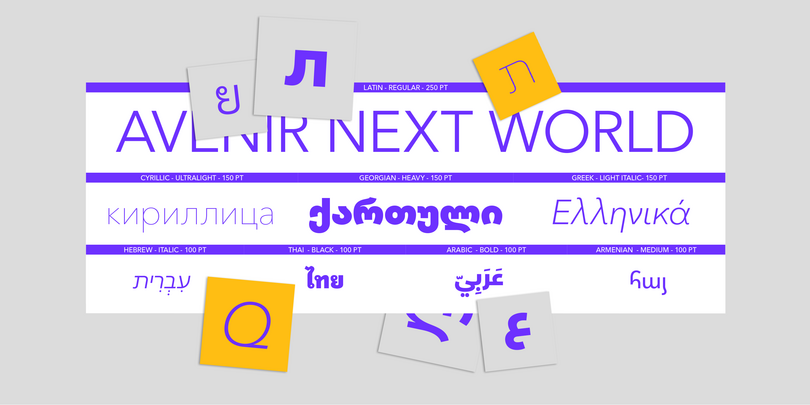
Adrian Frutiger’s masterpiece Avenir Next has grown so popular among multinational brands that it became apparent we needed even more language coverage, so we created the expansive family of Avenir Next World. This includes the common Latin, Greek, and Cyrillic scripts, and also includes Arabic, Hebrew, Georgian, Armenian, and Thai scripts. Thousands of glyphs are all neatly packaged together across a consistent set of weights.
While this package can solve problems with brand fidelity across multiple markets and localizations by bundling scripts together, the question still remains: what can I pair it with to change my brand’s tone of voice?
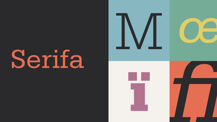
Serifa® by Linotype
The geometry and proportions of Serifa play nicely with Avenir Next, while offering the stylistic contrast of a slab serif. Really designed to pair with Univers, but still designed by Adrian Frutiger.
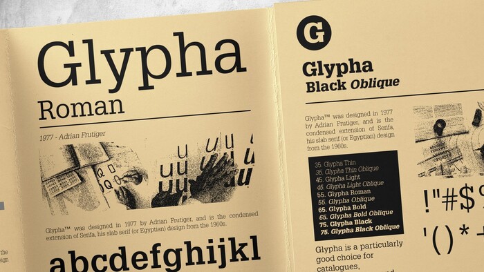
Glypha® by Linotype
The geometry and proportions of Serifa’s condensed cousin, Glypha, will offer an even broader slab serif palette.
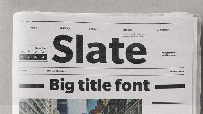
Slate™ by Monotype
This is both a pairing and alternate suggestion. I describe these as “your best denim” because they have a no-nonsense approach to them, they are plain but precise. They could be dressed up or down, all-purpose.
If the geometric proportions of Avenir Next are too wide, you might try Slate instead. It’s a bit narrower and therefore a touch softer to read in longer body copy. With low stroke contrast and open apertures, it pairs harmoniously with Avenir Next World. For example, you could use the Latin portions of Slate for branding and pair it with Avenir Next World for the Arabic.
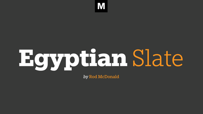
Egyptian Slate™ by Monotype
Slate also comes with a slab serif companion called Egyptian Slate which could be paired with Avenir Next World by itself. While Serifa and Glypha have horizontal terminals, the open apertures in Egyptian Slate are more harmonious with Avenir Next.
Note: Slab serifs used to be labeled as Egyptian in the early 20th Century, perhaps to exaggerate their novelty at the time. It also serves as a nod to the history of writing because Egyptians used slate stone for engraving.
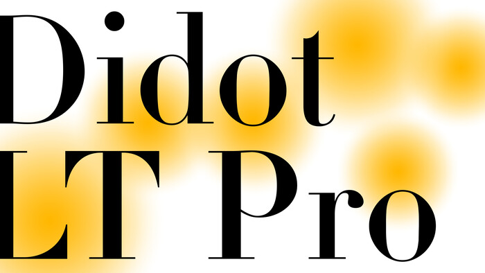
Linotype Didot™ by Linotype
The high stroke contrast of Neoclassicist and Rational serif types as in the Didone genre, often led by Didot and Bodoni cuts, are a great pairing for Avenir Next. Similar proportions and apertures makes them compatible, while allowing the stroke contrast differences to stand out. Didot is a perennial favorite for sophisticated and elegant brands and publications. Use them with lots of white space to play up the modern, clean, and luxurious tones.
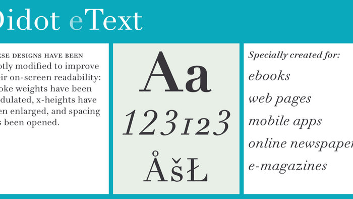
Linotype Didot™ eText by Linotype
If you find Didot’s traditional weights to be too light or sharp for digital work, try the eText versions which are beefed-up and tuned for text on screen.
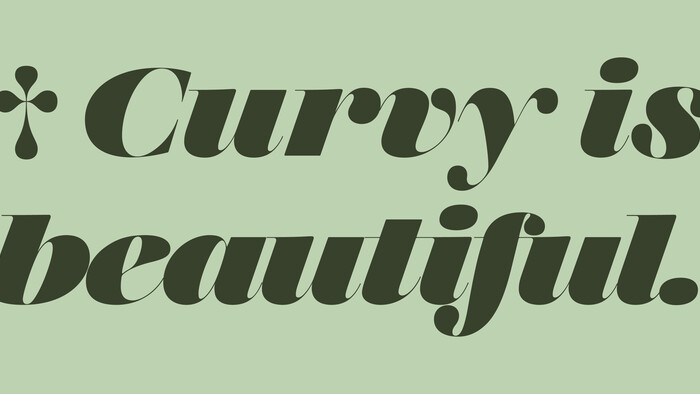
Monotype Walbaum
Walbaum is one of our latest serif restorations. It is richer and warmer than a typical Bodoni or Didot Modern serif. The underlying skeleton and proportion pairs well with Helvetica, while the softness contrasts nicely.
A full breadth of optical sizes ensures its performance in print and screen. We even have decorated styles and ornaments. There are 6, 12, 18, 60 and 96 point masters.
It’s elegant and charming in ways that other Didone designs aren’t.
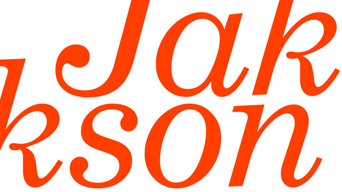
Century® Schoolbook by Bitstream
Again, the proportions and apertures of Avenir Next are reflected nicely in Century Schoolbook and similar serif typefaces in the Clarendon style. The bracketing on the serifs and moderate stroke contrast give it a tone that is more sophisticated than a typical slab serif, but not quite as fussy as a high contrast serif like Didot. Because these typefaces were used to print so many books in the last century, they are associated with publishing, and often look informative, sincere, and trustworthy. They may not be perfect for every project, but they have lasting charm that is easy to live with and easy on the eyes.
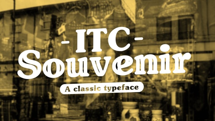
ITC Souvenir® by ITC
This typeface can produce quite a bit of dazzle, especially at headline sizes. ITC Souvenir is soft, approachable and casual, and can be a dramatic pairing option with the understated geometry in Avenir Next.
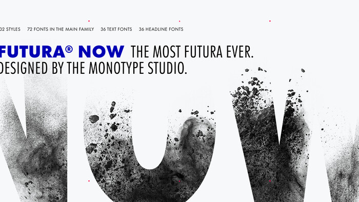
Futura Now™
Here are a few other Geometric sans serifs that could benefit from pairing the extra languages available in Avenir Next World. For example, if you have Futura Now or FF Mark for your main brand typeface, you could pair it with Avenir Next World for the Arabic and Hebrew. You could start with any of these below, then fill in the rest of your market localization requirements with Avenir Next World.