Ionic No5
Ionic No5 Pairings
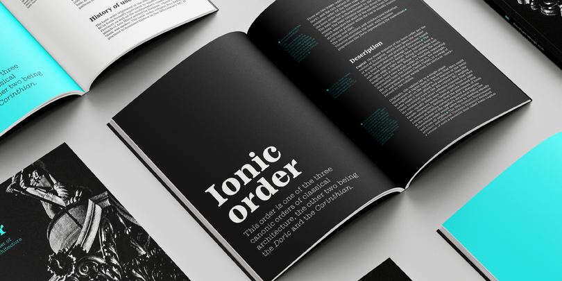
Finance fonts
Curated by The Monotype Studio
Ionic No5 is a refresh of a classic Linotype Clarendon-style serif, another restored classic from the Monotype library, much like the recent updates to Walbaum and Helvetica Now. The original typeface was designed to be printed and read at small sizes, popular with newspapers in the 20th Century at its birth. The restoration and refinement of this typeface has bestowed a greater sense of clarity and directness, resulting in a smartly stylish, utterly captivating appeal.
These styles were quite popular for books and newspapers for a long time, so we think of them as editorial or bookish. Not dull, but thoughtful. Designers today can use that association to their advantage as a visual shortcut to convey similar meaning and tone. More attention was given to modernizing the typeface with the introduction of sharp edges & finishes.
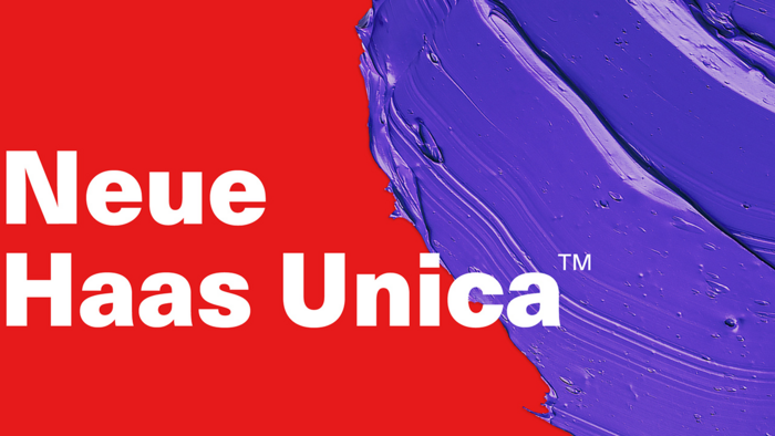
Neue Haas Unica
Neue Haas Unica™ is Monotype’s revival of a typeface that has attained almost mythical status in the type community. Unica® was an attempt to create the ultimate sans-serif – a hybrid of Helvetica, Univers and Akzidenz Grotesk. Designed by Team ’77 and released to great acclaim in 1980, Unica went missing under a heap of legal disputes and has never been available as a full, digital typeface. Until now.
Helvetica Now
Helvetica® Now is a new chapter in the story of perhaps the best-known typeface of all time. Available in three optical sizes—Micro, Text, and Display—every character in Helvetica Now has been redrawn and refit; with a variety of useful alternates added. It has everything we love about Helvetica and everything we need for typography today. This is not a revival. This is not a restoration.
This is a statement.
This is Helvetica Now: for everyone, everywhere, for everything.
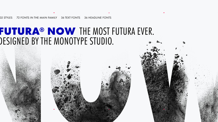
Futura Now™
Here are a few other Geometric sans serifs that could benefit from pairing the extra languages available in Avenir Next World. For example, if you have Futura Now or FF Mark for your main brand typeface, you could pair it with Avenir Next World for the Arabic and Hebrew. You could start with any of these below, then fill in the rest of your market localization requirements with Avenir Next World.
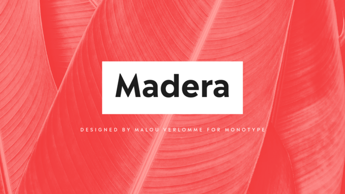
Madera
Introducing Madera by Malou Verlomme – a straight-talking typeface that’s created with graphic designers in mind. Efficient and adaptable, Madera works across print and online, and has pleasingly crisp apexes that add some extra bite to the design. Buy it now – eight weights including uprights and italics.
Macklin
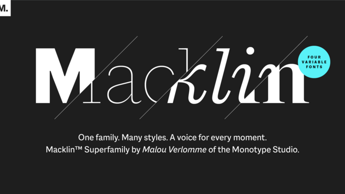
Macklin is inspired by the era when type leapt off the pages of books and onto large-scale posters and advertisements. With a distinct twist on its typographic predecessor, Macklin’s sharp yet elegant forms push the superfamily to a place that’s more suited to contemporary use and modern design. Macklin comprises 4 sub families and 54 fonts with 9 weights from hairline to black, offering a broad palette for visual expression.
Trade Gothic Next
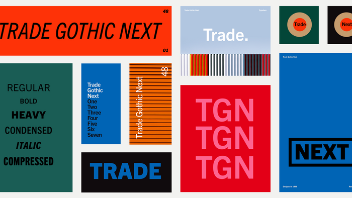
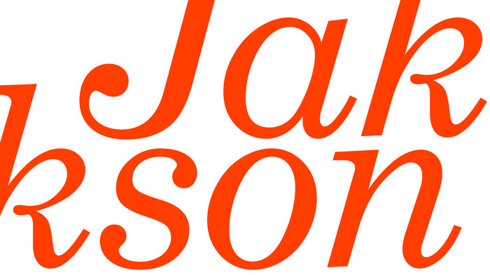
Trade Gothic Next is Akira Kobayashi’s 2008 revision of Jackson Burke’s 1948 design. Developed over many years, the original Trade Gothic was filled with many inconsistencies.
If you want to play up the vintage letterpress look, or to dial up a casual tone, pair it with Trade Gothic.

Clarendon BT
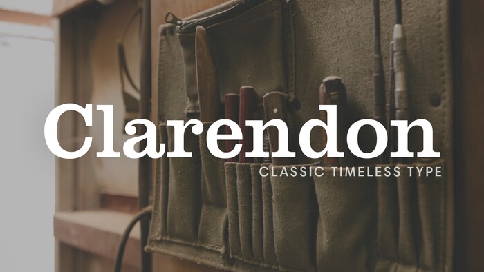
The first slab serif fonts appeared at the beginning of industrialization in Great Britain in 1820. Clarendon and Ionic became the names for this new development in England, known as English Egyptienne elsewhere in Europe. Clarendon is also the name of a particular font of this style, which, thanks to its clear, objective, and timeless forms, never lost its contemporary feel.
In small point sizes, Clarendon is still a legible font and in larger print, its individual style attracts attention.
Clarendon LT
Trade Gothic Next is Akira Kobayashi’s 2008 revision of Jackson Burke’s 1948 design. Developed over many years, the original Trade Gothic was filled with many inconsistencies.
If you want to play up the vintage letterpress look, or to dial up a casual tone, pair it with Trade Gothic.
Century® Schoolbook by Bitstream
Again, the proportions and apertures of Avenir Next are reflected nicely in Century Schoolbook and similar serif typefaces in the Clarendon style. The bracketing on the serifs and moderate stroke contrast give it a tone that is more sophisticated than a typical slab serif, but not quite as fussy as a high contrast serif like Didot. Because these typefaces were used to print so many books in the last century, they are associated with publishing, and often look informative, sincere, and trustworthy. They may not be perfect for every project, but they have lasting charm that is easy to live with and easy on the eyes.