Trajan Alternatives
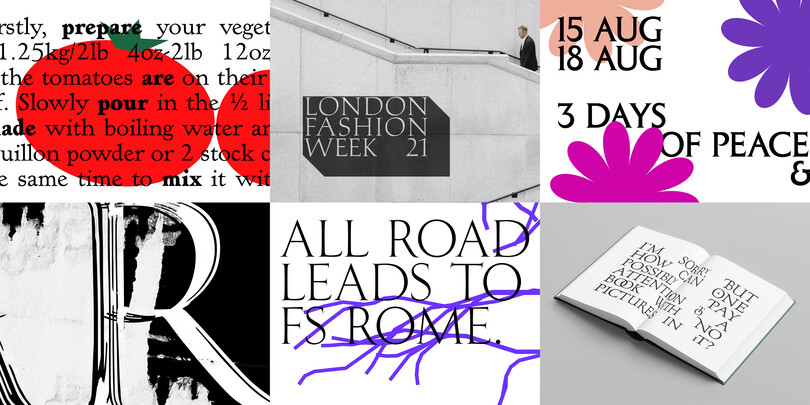
Trajan, 1989, from Carol Twombly at Adobe, has become a sort of default, go-to design that gives a classical, formal, or majestic feel to layouts. It's even become a cliche in the design of movie posters, initially conveying gravitas and nobility, but lately sliding more into the esthetic of horror movies.
Trajan is closely modeled on one specific inscription, which is the source of its name: The renowned carved letters at the base of the column commemorating the Roman emperor Trajanus. But it isn't the only example of classic capital stone inscriptions in Rome, or in the world. There are designs that could convey more sensuality, fluidity, even swing.
The Monotype Studio has curated a few suggestions on alternatives that may suit your project better without loosing the design essence found in Trajan.
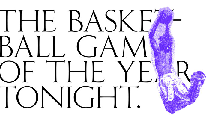
Fontsmith Rome
Based on similar models, FS Rome takes the style all the way in the imperial, refined direction. Light and finely detailed, this would work for very large sizes and very short words. Only one weight means there is a limit on how small you could use it. Imperator is a new design whose caps draw from the Imperial Roman, but also includes some calligraphic sharpness and less extreme proportions. It also has a lowercase.
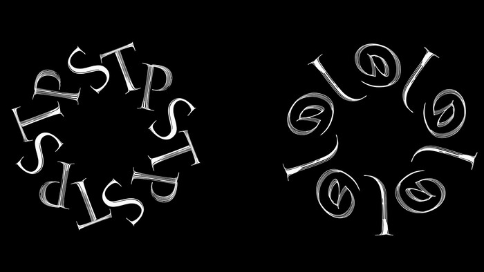
Stevens Titling
This is a typeface that returns to the first origins of the classic Roman inscriptions. The theory of how the letterforms were originally drawn or drafted on stone before carving proposes that they were painted on with a wide brush. That brush alphabet is translated into a series of typefaces by John Stevens, world-renowned expert in brush lettering in the imperial Roman style. The four styles are painted in a range of increasing roughness and dryness, revealing more of the overlapping brush strokes. They have a lot of movement and fluidity in them in addition to the roughness.
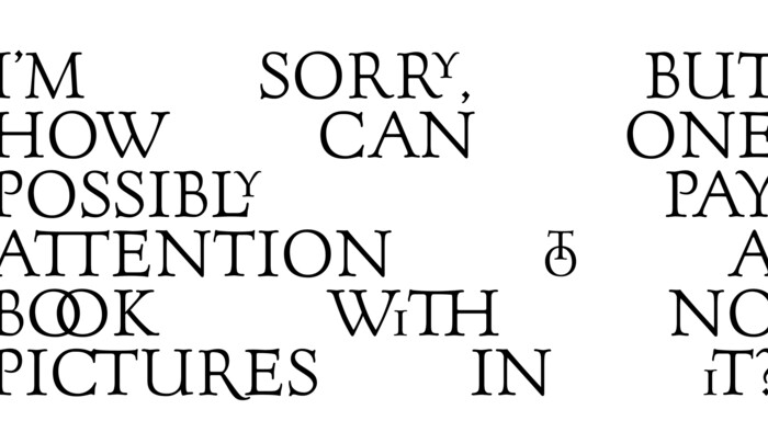
Goudy Forum
Fred Goudy was a prolific independent type designer in the 20th century. One of his interests was the stone inscriptional roman, same as Trajan. Goudy was inspired by various inscriptions he saw while traveling in Rome in 1910, including the Trajan inscription. Forum Title was a loose interpretation of letters Goudy was able to get rubbings from. Very few letters provided the basis of the design, so it relied more on Goudy’s inventiveness to complete the alphabet. It originally had just caps, but Tom Rickner expanded the design with small caps and ligatures, making it more flexible.
Hadriano
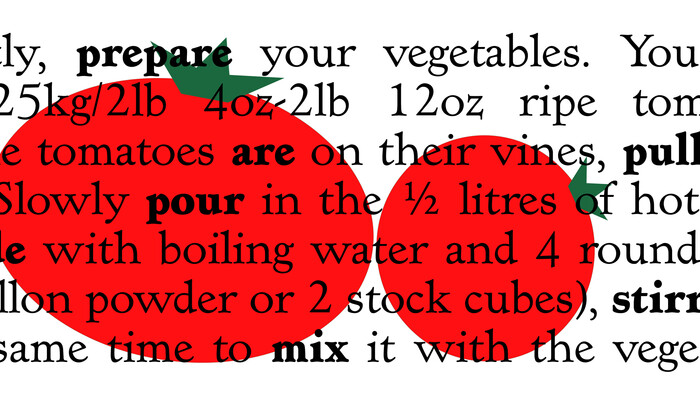
Hadriano is a design that grew out of just three letters Goudy took clandestinely, in the Louvre, while traveling. It exhibits Goudy’s trademark softness and fluidity. Hadriano especially takes the style and pushes it toward boisterousness and fun, rather than stern authority. Hadriano was originally very bold and had no lowercase. Since that initial design, lowercase and a range of weights have been added, making it more versatile.
Columna
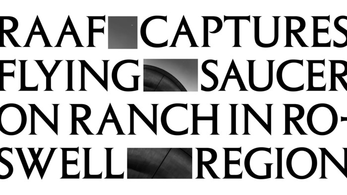
This design is all about majesty and grand proportions. Columna has only caps, moderate stroke contrast and small serifs, making it more versatile than Trajan. Columna is spare and technical, giving an impression of imperial stature.
Palatino
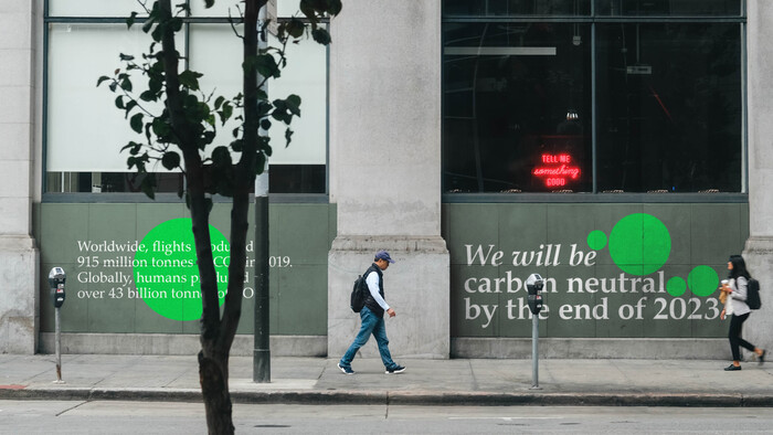
Hermann Zapf’s first popular typeface, based on his own elegant calligraphy, effective in text and display, carrying little trace of the Trump Mediaeval eccentricities.