Type trend theme - Hand was here
Behind the Font
Type design
Typography
Curated by the Monotype Studio
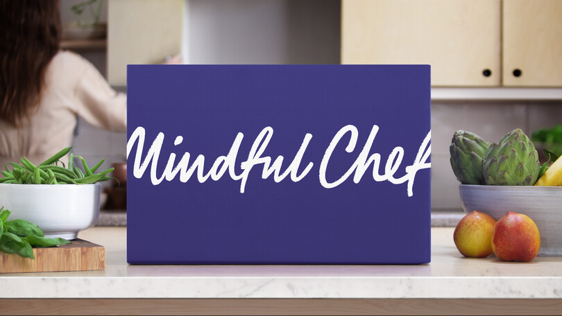
Hand was here - a key trend highlighted in our 2021 Type Trends Report. Lets begin in the mid-2000s, when there was a surge in brands looking to ground themselves in a sense of the handmade, the material feeling of quality craftsmanship, the process of making something from scratch. The hand was here trend is all about hand-drawn lettering and woodblocked textures—type that evokes the nostalgia of your lunchtime walk to the food market, the hand painted street-food signs and mom-and-pop storefronts, reminders of the human experience we so covet from our homes.
This trend has come and gone, but now, in a world gone fully digital, it’s no surprise that people would be searching for something warm, familiar, and human again. From a purely typographic perspective, this trend leans on innovations and advancements in the creation and use of type. The humanity of these typefaces gives them soul, and in turn, they nod to a sense of wellness, care, and the timeless endeavor of creating something truly unique - let’s take a look at some typefaces that reflect this:
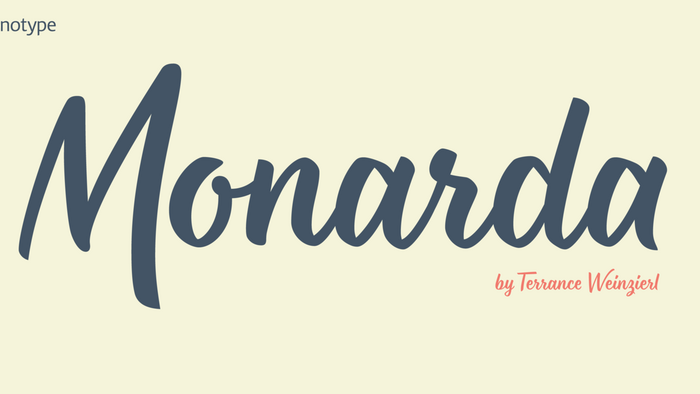
Monarda™
A bright personality and fearless demeanor.
Monarda™ is Terrance Weinzierl’s take on the loud and splashy brush scripts of the 1950s. It’s energetic, playful, and equally at home in hardcopy headlines as it is in interactive banners. In addition to the basic alphabet, OpenType® fonts of Monarda are also awash in super-sized swash caps, contextual alternate characters and ligatures.
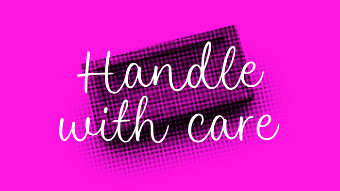
Hylandia
Delicate but spirited, Hylandia is a cursive script with gorgeous looping letterforms drawn with a light touch using a thin brush pen. This font has a sensitive sense of delicacy and care, with clear roots in calligraphy and tradition. Try the Alfie typeface too, if you’re looking around this ballpark.
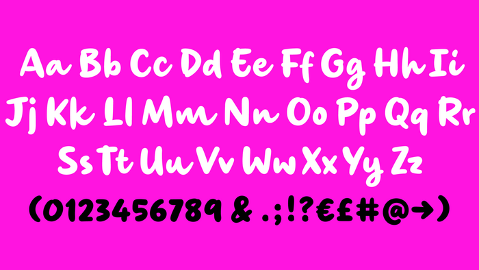
Morning
Morning’s spirited, bouncy cursive letterforms feel like a painter’s signature; it’s a familiar style but with something of a twinkle in its eye. The style of Morning looks to imitate wet brush and ink lettering, and dances between seriousness and play. You’ll find a mix of letter connections here, and some ligatures, too.
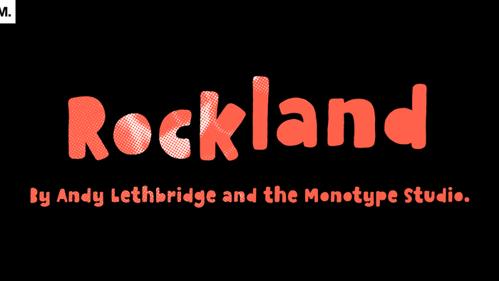
Rockland
This is an original, confident and cheeky little font; characterised by its boldness and dense letterforms, which boast a solid texture and distinctive lack of counters. Drawn with a marker pen, the bounciness of Rockland counteracts its solidity to make for a friendly aesthetic that’s as confident as it is playful.
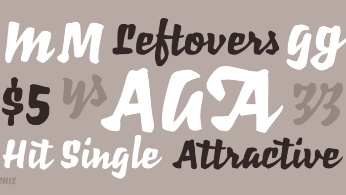
Richie
A display script typeface with a heavy texture and big personality, Richie looks like a combination of lettering, calligraphy, and cut paper. Bold is an understatement. Pair it with an easy-going sans or serif to balance it out.
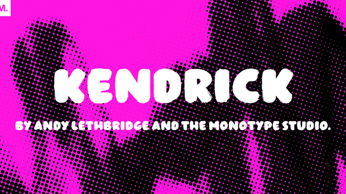
Kendrick
A heavy brush rendering simple forms makes Kendrick approachable and charming, while having the gravity and volume of a mural. Pair or alternate with Terry Junior if you need a similar design with a lighter brush, or a Cyrillic character set.
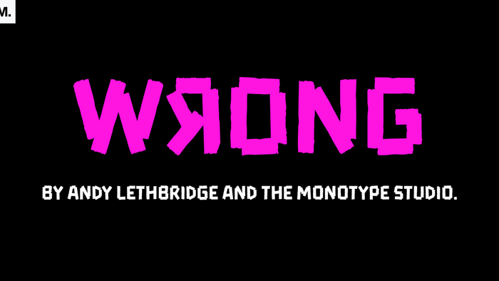
Wrong
A smashing DIY-looking success, Wrong is built from torn tape to create a bold, solid and square-jawed design. The omitted corners give it a balanced texture and sparkling visual interest at all sizes. The lowercase is an alternate set of caps—pop them in if you get a double letter combination to simulate the lettering effect like this: LETteR.
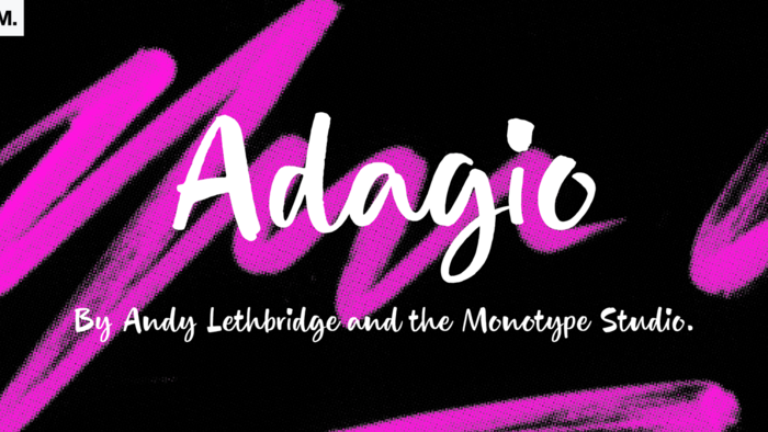
Adagio
Adagio is a spontaneous, casual kind of font but don’t be fooled into thinking just because it’s all uneven and painted that it’s a pushover. There’s a bold brush pen at the heart of the design as well as a full set of alternate lowercase characters if you’re looking for something extra.
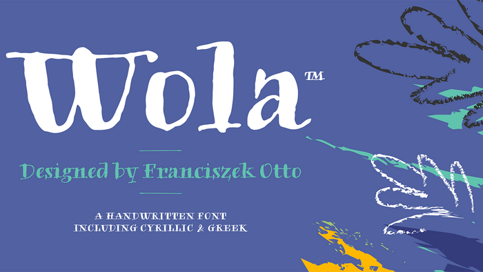
Wola
Similar to the stroke contrast of Adagio, but on a Bodoni-like modern serif armature. It’s very inky again, but in a controlled state. It’s ready to go to work with a healthy character set extending to Greek and Cyrillic.