Condensed Contenders
Curated by The Monotype Studio
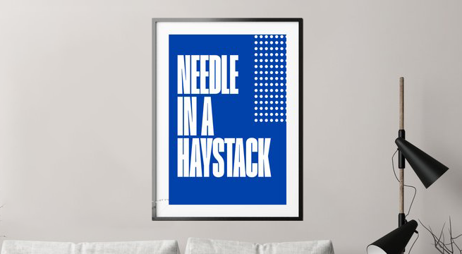
Many large typeface families have condensed styles, but it’s not a given. Some typefaces drawn specifically for headline use might only come in condensed proportions, but be packaged as a ‘regular’ style. The name doesn’t matter, just the design matters and how it suits your work. You might also see the term compressed in font names which is typically even narrower than a condensed style. On the other end of the spectrum, you may see terms like wide or extended to describe something that has wider proportions than the regular-width. Again, it varies from design to design. Some variable fonts include a width axis that may stretch from condensed all the way to extended—this is one aspect of the variable speed trend we’ve been reporting. Variable fonts with a width axis can really dance when animated. Using various weights and widths of the same typeface helps build harmony and hierarchy in your designs.
Condensed type styles are all about proportions. Not only do they shorten the overall line length and space required for the headline, they are often spaced tighter than a typical text style. Depending on the brand you are working with, the typeface used for headlines might play a powerful role in the overall aesthetic. Let’s take a look at some families that have great condensed options, hand-picked for good looks and utility.
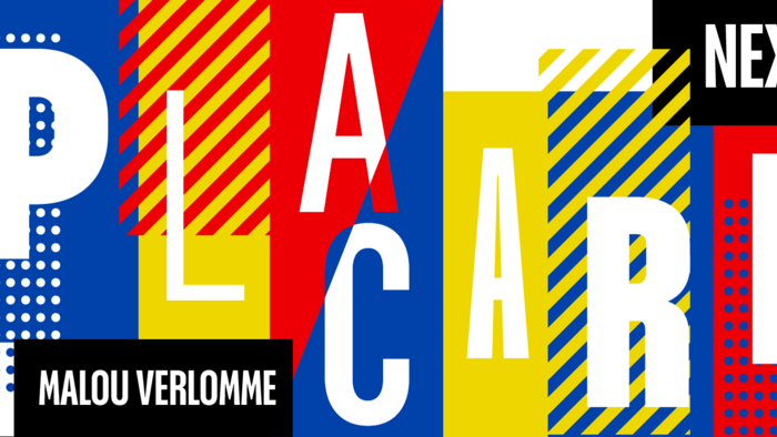
Theatrical Impact.
Placard Next®
Bursting with personality.
Placard Next is a juggernaut of condensed styles, purpose-built to serve every corner of ones condensed type needs. It varies from extreme thins in Hairline styles to the juiced Compressed Bold. Add in the Rounded versions and you double the palette. It’s a perfect poster typeface for theatrical impact.
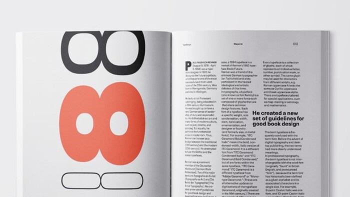
Digital Focus.
Neue Plak™
A revived version of a hidden gem by Paul Renner.
Neue Plak is another clean-cut sans serif with a variety of widths which is available in variable format. While the condensed and wide styles will be suited for headlines and subheads, the Text styles are the real workhorse capable of handling mass amounts of text.
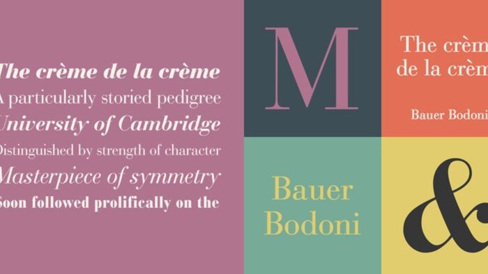
Fashion & Health.
Bauer Bodoni Bold Condensed
The crème de la crème.
Bauer Bodoni Bold Condensed is a leader in the Neoclassical serif genre. It’s base design from Bodoni is elegant and striking, and this bold condensed style fills the headline duties well. It looks crisp and organized without being rigid or mechanical. It’s best for medium to large sizes, but in huge sizes above 100 px you may need to tighten the tracking a bit.

Cultural Identity.
ITC Legacy Serif
Continuing tradition.
ITC Legacy Serif is a beautiful and contemporary interpretation of the Jenson humanist types. It is rich with detail and history, making it excel in sophisticated and traditional contexts like a visual identity for a cultural institution, for example. The regular-width styles are pretty wide, so the condensed styles are a welcome addition.
Packaging.
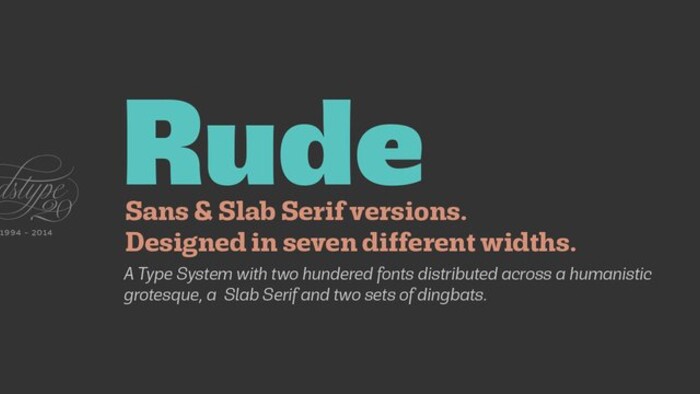
Rude Slab Extra Condensed
A no-nonsense companion.
If the usual 19th Century slab serifs are too clunky, this sleek and lively slab serif, Rude Slab, comes to the rescue. The large x-height and dynamic forms in the lowercase are a stand-out feature. This set of extra condensed styles are headline champions with a range from Thin to Black. They are spaced tightly out of the box, so be careful if you use them smaller than 40 px or so.
Brand Systems.
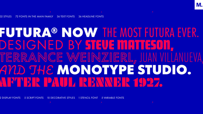
Futura Now.
The Most Futura. Ever.
This remastered Futura family has a full set of condensed styles, not only in weights, but optical sizes as well. The Text styles are looser and better for smaller sizes, and the Headline styles are spaced tighter, best for large sizes. Greek and Cyrillic scripts are available as well in all condensed styles, letting this famous geometric sans go to work in even more markets and locales.
Industrial or Technical.
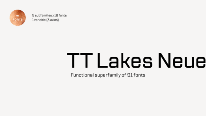
TT Lakes Neue
Inspired by the functionalism era.
TT Lakes Neue. Square sans serifs like this one, led by the popularity of Eurostile from the mid-century, are long-lasting favorites for industrial and mechanical aesthetics. It’s closed apertures and flat stroke joins along with the subtle rounded terminals give this a perfect bent pipe look. The square shapes hold up under pressure as this typeface changes width to condensed and compressed extremes.