Neue Frutiger World Pan-CCJK
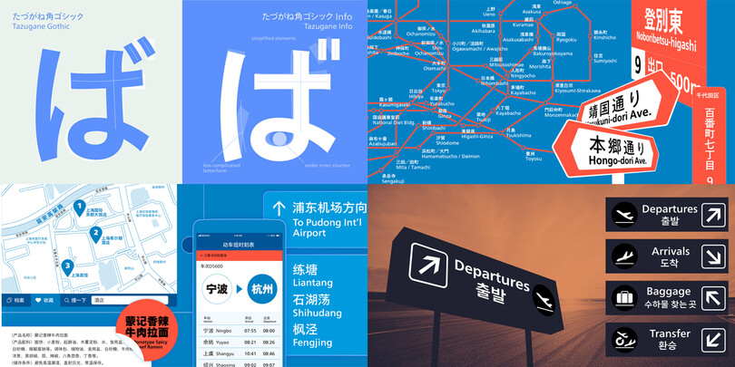
Font Legibility
Font management
Curated by the Monotype Studio
Monotype’s premier Pan-Asian collection of typefaces is a set of three related families, all designed in the Humanist style to accompany each other, as well as a wide range of Sans Serif families in Latin or other scripts.
The M XiangHe Hei, Tazugane Gothic, and Seol Sans families feature Neue Frutiger for their Latin glyphs, and work harmoniously with Neue Frutiger World.
M XiangHe Hei® SC Std
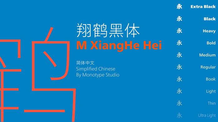
The M XiangHe Hei typeface merges traditional brush strokes with modern letterforms to carefully balance traditional calligraphy with humanist design. Named for the smooth movements of a flying crane, the M XiangHe Hei typeface is designed to glide across the page, and features strokes that are partly derived from the Kaishu calligraphic style – an everyday script which dates back hundreds of years.
M XiangHe Hei features Neue Frutiger for its Latin glyphs, and works harmoniously with Neue Frutiger World and Monotype’s CJK typefaces Tazugane Info (Japanese) and Seol Sans (Korean).
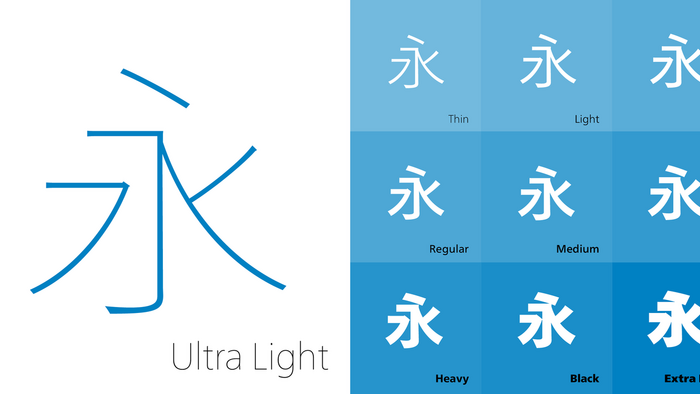
M XiangHe Hei® SC Pro
M XiangHe Hei is a great choice for global brands using Sans Serif Latin typefaces looking to maintain their visual identity, and communicate with a consistent tone of voice with Simplified Chinese.
The M XiangHe Hei typeface comes in both Simplified and Traditional styles. The former is available in both a Standard (GB-2312) and Pro (GB-18030) character set. The Standard character set of 8,099 glyphs is typically sufficient for most commercial applications on the desktop and web. The Pro character set of 29,380 glyphs is required for shipping hardware or software within the PRC.
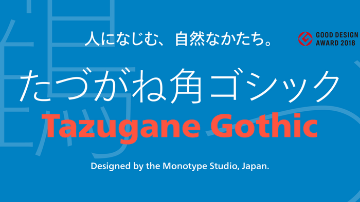
Tazugane® Gothic
Tazugane Gothic and Tazugane Info are the two related Japanese families. Tazugane Gothic is the first original Japanese typeface in Monotype’s history. This Sans Serif type was designed to set a new standard for the widely used styles most familiar to Japanese readers. It’s goal is to meet the diverse typographic needs of the present day, including use in magazines, books and other print media; in digital devices such as smartphones and tablets; in branding and corporate identity systems; and in signage for buildings, highways and mass transit.
“Kana symbols we use today developed before the ninth century from traditional letters written vertically; some characters are designed lengthwise and when set horizontally they create large gaps,” explains Kobayashi.
Tazugane® Info
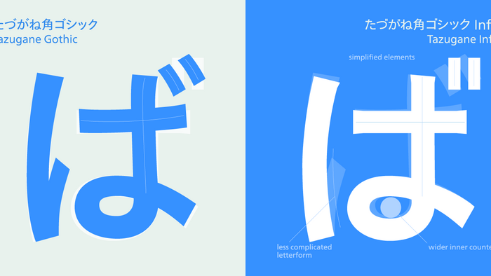
Tazugane Info is a clean-cut counterpart to Tazugane Gothic, created for horizontal setting, which is particularly useful for smartphones, information panels and car navigation systems – which don’t rely on the traditionally vertical typesetting used in novels, newspapers and magazines in Japan.
As well as meeting a need for typefaces that work horizontally, Tazugane Info offers more of a geometric and restrained appearance than the humanistic personality of its Tazugane Gothic counterpart. Emphasis has been put on horizontal strokes to create a smooth, uninterrupted flow.
“While Tazugane Gothic fits perfectly when your job requires an organic and friendly tone of voice, Tazugane Info provides a more solid look,” says Kobayashi. “I hope that having two options will make it easier to choose an appropriate tone of voice to convey information or brand messaging
Seol Sans®
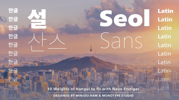
The Seol Sans design offers a fresh palette for designers working with the Korean alphabet, particularly those looking to pair Latin and Korean alphabet (or Hangul) forms without creating typographic friction. The choices for Hangul fonts that work well with humanist Latin typefaces are limited.
As Monotype’s first original Korean design, the Seol Sans typeface is a humanist take on the traditional rigid and hard designs of Hangul characters. The Seol Sans design more closely resembles the natural curve of hand-written characters. Seol Sans features Neue Frutiger for its Latin glyphs, and works harmoniously with Neue Frutiger World and Monotype’s CJK typefaces Tazugane Info (Japanese) and
M XiangHe Hei (Chinese). Seol Sans is a great choice for global brands using a Sans Serif design looking to maintain their visual identity, and communicate with a consistent tone of voice in the Korean market.