Sci-Fi Superstars
by Terrance Weinzierl
Monotype’s Creative Characters podcast wouldn't be complete without inviting designer and author Dave Addey to the show. Dave is a UI designer by day who started a blog called Typeset in the Future after noticing that many science fiction movies used similar fonts to establish a futuristic feel. Eventually, the blog became a book project of the same name, and he embarked on extensive explorations into films like 2001: A Space Odyssey, Pixar’s Wall-E, and Moon. Host Terrance Weinzierl dug into Monotype’s deep library, which contains most of the typefaces mentioned in Dave's work, and compiled a collection of fonts perfect for your next futuristic project.
Author Dave Addey recently joined the Creative Characters podcast to share his exploration into how typography and design are used in sci-fi movies. Check out his episode today.
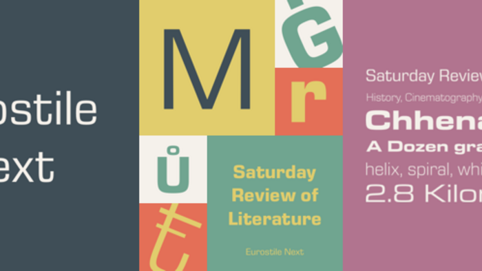
Eurostile® Next
The Bold Extended style of Eurostile became a sci-fi icon because of the massive influence of Stanley Kubrick’s 2001: A Space Odyssey. The rounded square forms harmonize with many industrial or engineered aesthetics, like those found in space ships, automobiles, and Mid-Century furniture.
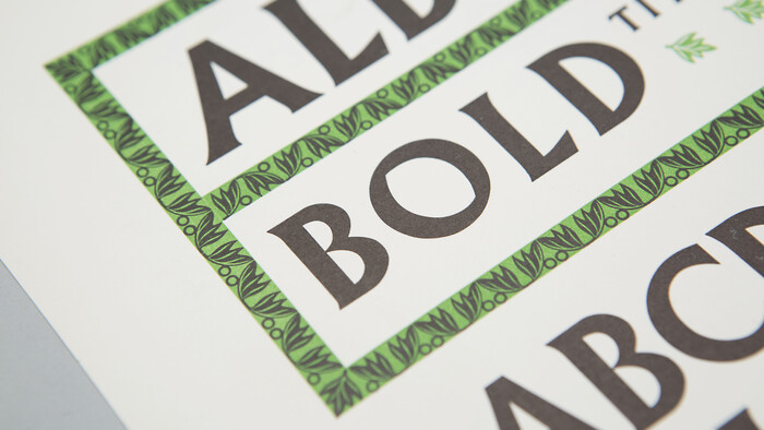
Albertus® Nova
From Kubrick to David Lynch’s Dune, Albertus captures the chiseled charm of early human achievement, with the lasting beautiful proportions of Trajan’s Column and subsequent Futura. In all caps, its decidedly monumental looking. Albertus is also a favorite of director John Carpenter.
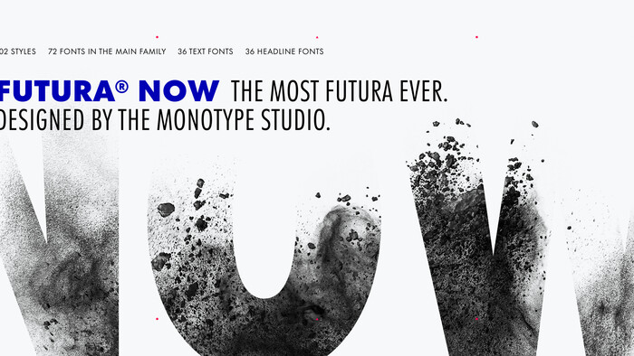
Futura® Now
Futura remains as futuristic looking today as it did when it was released in 1927. Futura has the classic proportions of letters found on Trajan’s Column, rendered in a low stroke contrast now a signifier of a geometric sans serifs, and was innovative with a matching lowercase. It is both forward and backward looking at the same time, which makes it suited to reflecting human technology in fiction. The Display styles are suitable for sci-fi too. Gill Sans Nova has more humanist details, and serves as a respectable alternate.
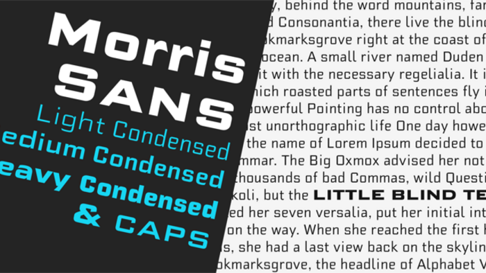
Morris Sans®
While Bank Gothic is very widely used, it can be limited in its style and character set range. Morris Sans mimics the style, but it more versatile by containing more weights, as well as a lowercase in addition to the small caps for the classic look. Morris Sans is simply better suited to contemporary typographic demands.

Univers® Next
While Univers Next gets crowded in the Neo-Grotesque sans genre, it excels at looking more sleek and elegant than Helvetica most of the time. The Condensed and Compressed styles are particularly good for setting title screens or props while maintaining legibility.
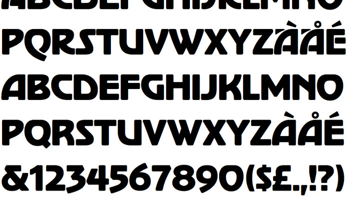
Stop™
From the same type designer as Eurostile, Aldo Novarese created a huge range of styles. The Stop typeface is notable for its geometric, stenciled, and modular approach which makes modifications for logo work easy. You will see it used somewhere, either in a logo on the side of a van, or in a sci-fi work. Look for the ITC Bauhaus or Pump typefaces for another riff in this design space.

Handel Gothic
Handel Gothic is another play on square proportions and geometric finishing. It has sleek forms which are less traditional that what you would see in Futura or Eurostile. It’s right at home amongst sci-fi, especially something that requires a retro-chic look. It has a wealth of alternate glyphs to explore, which can make headlines even more unique.
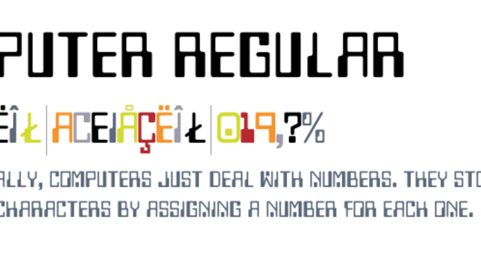
Computer
The definition of a computer has been blurred in the 21st Century, but circuit board imagery is still used to label something as technology in a simple and direct way. The Computer typeface achieves that in a friendly and cute way with letters that look like circuitry. If treated right, it could be used for campy or ironic effects. The Data 70 or OCR typefaces are an alternate in this style.
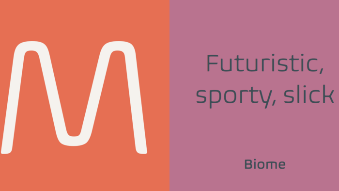
Biome™
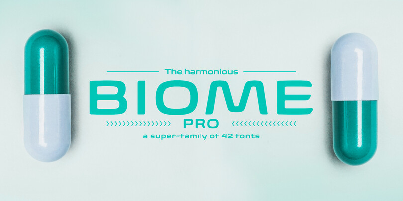
Biome uses the proven square proportions from Eurostile and puts a substantial organic spin on it. It has both round and sharp features, and could be used with either natural or engineered imagery. It’s flowing and open forms make it very legible. If the lowercase is too much for you, retreat to using it in all caps.