URW Type Foundry highlights.
Brand Design
Font management
Curated by the Monotype Studio.
URW Type Foundry.
Based in Hamburg, Germany and now part of Monotype Studio, URW Type Foundry is an innovative font and software provider with extensive experience in designing and engineering fonts to service the needs of global brands. As the direct successor of digital type pioneer URW GmbH, URW has deep expertise in making fonts work. IKARUS, the company’s system for font design and production, has become a de-facto standard around the world.
URW Dock
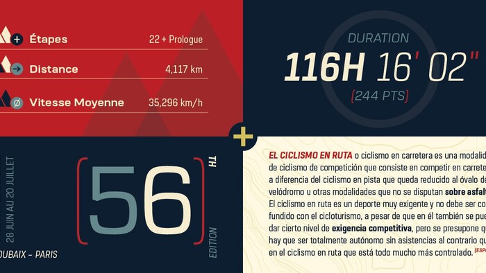
URW Dock is a contemporary geometric type family inspired by the square sans typefaces of the 60s, but designed to meet today’s requirements for a multifunctional font with a wide range of styles and an extended character set. Its high legibility and clear informative and technological appearance are perfectly suitable for infographics, signage, and way-finding systems, as well as for use in apps, video games, and infotainment software. While the upright styles communicate a clear, professional and informative message, the italics express a technological, dynamic and forward-thinking spirit.
Marble
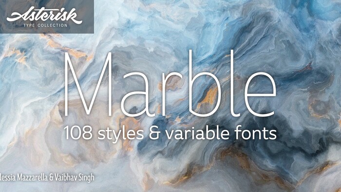
Marble is a modern sans serif designed for corporate and publishing use. It is rounded and approachable, deriving its character from the generous roundness of the x-heights balanced by striking horizontal and vertical cysts to the terminals. The result is a readable font that encourages the eye to move from one shape to the next, and that offers a range of possibilities for digital and print. With multiple weights for each variant, the Marble family is ideal for establishing harmonious hierarchies of information in headlines, subheadings, captions, and body copy styles.
Chevalier
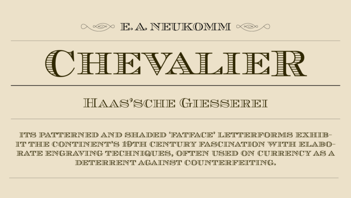
Chevalier is an engraved, decorative, all-capital typeface. Its patterned and shaded ‘fatface’ letterforms exhibit Europe’s 19th century fascination with elaborate engraving techniques, often used on currency as a deterrent against counterfeiting. For this reason, Chevalier evokes images of bank notes and finance. It is also suitable for business letterheads and corporate stationary, headlines, and packaging, for which a clean, safe, established image is desired.

Schnebel Slab Pro
Schnebel Slab Pro is a refreshingly clear and strong interpretation of a contemporary Antiqua with subtle contrast and firm serifs, which offer excellent readability at very small size, and, at the same time, provide a lot of expression for use in headlines. The italics, drawn specifically for this purpose, contribute to a harmonious picture that never loses creative tension, thanks to its aesthetics. The careful addition of ligatures, small caps, and proportional and old-style figures allows for well-proportioned typesetting.
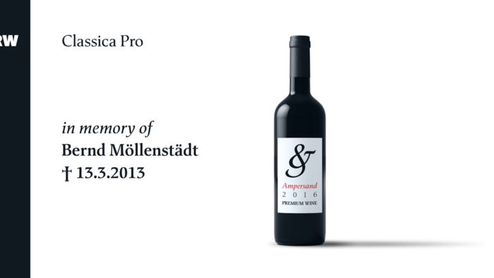
Classica Pro
Designed by Bernd Möllenstädt and Volker Schnebel and published by URW, Classica Pro is a continuation of the existing Classic Light and Light Italic font families. A real alternative for letterpress printing, Classica Pro features the boldening of letters with an oblique axis and with hairlines that do not reach to the same extent as the general line widths. It contains all the typographic options for excellent typesetting, and is more readable and has a better appearance than other existing typefaces.
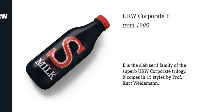
Corporate A S E
The Corporate ASE typeface trilogy consists of the Corporate A (Antiqua), Corporate S (Sans Serif), and Corporate E (Egyptian) font families. Initially designed for exclusive use by DaimlerChrysler as a corporate font, the ASE trilogy may now be licensed and used without restriction. The typefaces are perfectly in tune with each other, creating a design program of classical quality. The family has been enhanced over time by adding Pro versions of each family, as well as regular, bold, italic, and bold italic in Greek, Cyrillic, and all additional Latin characters to cover Eastern Europe.