Sophisticated Serifs by Monotype Fonts.
Curated by the Monotype Studio.

Brand fonts
Brand Design
Creative collaboration
Monotype Fonts.
Serifs, the short cross-strokes at the beginning and end of a letterform, originated from ancient Rome, where letters were chiseled into stone following the guidance of painted letters, which always flared at the end of the brushstroke. Serifs have many uses, including for text in print products, as they are more legible than sans serifs, especially at small sizes, and to create a specific look and feel for a brand. Monotype Fonts has options for every serif design need; here are a few samples from our serif inventory.

Gazpacho
Designed by Santi Rey and published by Monotype, Gazpacho is inspired by the serif typefaces used in editorial media in the 70s and 80s. The morphology of the letterforms makes this typeface ideal for display purposes like logos and big, bold headlines. Also, thanks to its large x-height it works perfectly on headlines with tight leading. On the other hand, its high contrast and very simple and recognizable shapes makes it highly readable, so it also works on small, long texts.

Amarga
The inspiration behind Amarga comes from the bitter taste of coffee. Amarga, from Latinotype, is a serif typeface with high contrast and pointed terminals, composed of 9 weights that range from a very heavy black version to a thin version plus italics, with a total of 18 fonts. Amarga has a great visual impact and is perfect for display uses in editorial design, web, branding, posters, and many others.

Ardina Display
Ardina Display, from DSType, is a soft and warm news typeface initially designed for the Portuguese newspaper Jornal de Notícias, then later repurposed for the DSType library with an extended set of characters. The font has slightly narrow proportions but a nice x-height – the right typeface for a seriuod newspaper that intends to achieve a very contemporary feeling. The foundry also offers separate Ardina families for text and title.

Apéro
Blending the best of multiple worlds, Apéro, by Resistenza, is a cheerful handwritten font family composed of 5 slab weights, 2 slab effects, and a sans serif. Handmade, friendly and classy, this family is inspired by a favorite tradition, “L’Aperitivo”, in which friends gather before dinner for refreshments. Handwritten to create a friendly and human feeling, the font’s letterforms are designed to reflect the charming mood of this event, while the sans serif has been inspired by some lettering found in old liquor labels.

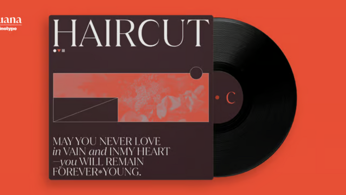
Juana
Juana, a display serif from Latinotype, is the result of a journey to self-discovery and part of a continuous exploration process. The font, based on the Jazmín typeface, features a more developed design while still maintaining the essence of the original version. The extreme contrast between thick and thin strokes gives Juana a harmonic and stylish look. Juana is perfectly suited for editorial design, branding, magazines, logos, headings and more.