
Type resources for designers and brand owners
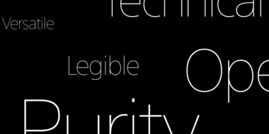
The SST font tackles a central challenge of branding – universality. The SST superfamily supports more than 90 languages including Japanese, Thai and Arabic.
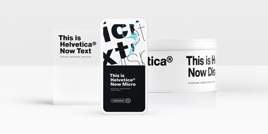
Designers and studios might be deeply familiar with Neue Helvetica, but it’s the product of a pre-digital era. Here are four reasons why it’s time to switch.

The World Cup is back, and all eyes are zeroed in on the best football … jersey fonts? We examine the tall task of designing for the world of sport.
Monotype’s Akira Kobayashi worked closely with Sony’s Chief Art Director Hiroshige Fukuhara to create an original typeface ready for nearly 100 languages.
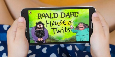
Monotype worked with noted illustrator Sir Quentin Blake and his team to recreate his handwriting as a bespoke typeface.
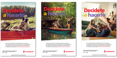
Scotiabank has long used Frutiger as its brand font. But as they expanded to new digital channels and regions, font licensing became too complex. Until now.

Monotype designer Terrance Weinzierl delivered a taste of modern Americana to Domino’s, with his modular, multi-weight Pizza Press typeface.

One of the best rebrands of 2016, the new Premier League identity features a typeface that performs confidently from screens and jerseys to TV and league tables.

Hearst Media has dozens of iconic titles. Learn how Monotype helped them evolve to meet the demands of a growing digital audience by offering more design flexibility and freedom.

Transport for London commissioned Monotype to remaster the 100-year-old Johnston typeface.