
Studio
A living logo for every parcel, person, and place: Monotype and Superunion help Hermes rebrand into Evri.

All Together: A Playful New Typeface That Reflects the Joy of M&M’S

A talk with Tom Foley on trends, the possible decline of Sans Serif, and what makes a type timeless.

What is optical sizing and how can it help your brand?

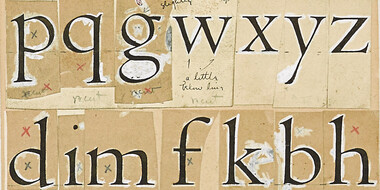
The Making of Toyota Type.Learn how Toyota Type was developed as part of the iconic automaker’s new brand identity.

What are font superfamilies and why do we need them?

Phil Garnham, Senior Creative Type Director at Monotype Studio explores the evolution of type in digital and celebrates the heritage at the heart of the Burger King rebrand.

Monotype’s brand refresh needed to achieve the same consistency of communication that it champions for its customers. But what’s the answer when you’re a type foundry with literally tens of thousands of fonts to choose from, and multiple products and services to design for?
Font superfamilies are vast collections of type that can meet a multitude of needs without compromising on consistency. But what defines a superfamily, exactly?
Ask him how Mosaic customers should feel about his foundry’s arrival in the Mosaic library, and Fontsmith founder Jason Smith barely skips a beat.
Fonts are more than a pretty face. Underneath their polished surface is an intricate array of data and functionality that few people ever see. Yet this hidden world is integral to the reliability, performance and appearance of a font.

When it comes to your brand, your customers aren’t just evaluating your logo or your colors or the typography, they’re evaluating how your brand makes them feel. More than anything, brands are built on feelings—all the thought you put into design and the experience is simply in service of creating a feeling.
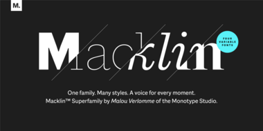
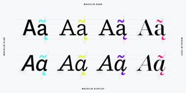
Malou Verlomme’s Macklin superfamily is a gently irreverent take on the display type of the late 19th century, with an elegant twist that updates these letterforms for modern use. Choose one style, or use the entire variable family as a type toolbox.

The city of Dubai partnered with Microsoft and Monotype to create a typeface that reflects Dubai’s energetic nature in both Latin and Arabic.
From alternates to X-height, this list of typography terms and definitions covers just about everything you’d want to know about fonts and typography.

Monotype’s brand refresh needed to achieve the same consistency of communication that it champions for its customers. But what’s the answer when you’re a type foundry with literally tens of thousands of fonts to choose from, and multiple products and services to design for?

