
Studio
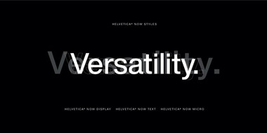
Designers from several leading brands share their own experiences with Helvetica®, and discuss why Helvetica® Now is suited for the needs of a modern world.

Placard Next is a reimagined version of a 1930s poster design, that takes all the original quirky details and refines them for digital use. Its condensed versions pack an instant typographic punch when used at large sizes, introducing some unusual flavor to posters, headlines and anywhere else designers need to make a statement.

Many Chinese typefaces have a reputation for looking dated and not reading easily on small screens— not M Ying Hei. It checks all the boxes that it’s forefathers can’t.

The first Japanese typeface from Monotype is a humanist sans serif, designed to work in partnership with Neue Frutiger. Tazugane Gothic sets out to introduce a new typographic standard, allowing designers to comfortably set Latin and Japanese characters alongside one another while maintaining visual harmony.

Neue Kabel brings back the liveliness of the original’s strikingly quirky characters, while adding in the long-lost italics and missing glyphs needed for it to address a wide range of editorial and branding purposes.
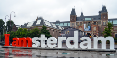
How do fonts influence your perception of a city and its identity? See how the right choice can convey the image of a place is and what it aspires to become.

When screens get smaller, spacing gets tight, details get lost, and forms blend together. The resulting legibility issues can make for a frustrating reading experience. Here’s how to find the fonts that can fix it.

Behind the font highlights the people and process behind the fonts you love and use. This installment features Carl Crossgrove of the Monotype Studio.

You know what they say, “classics never go out of style.” Maybe this is true, maybe it isn’t. But one thing is certain: When sans serifs took over typography in the early 1900s, they weren’t just a fad. They came to stay.

Finding the right brand font requires a deep understanding of who you are as a brand, and how you want to present that identity to the world.
Optical sizing has long been part of the type designer’s toolbox, but for many people the term may not be familiar. Here’s why that should change.
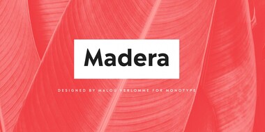
Malou Verlomme’s Madera is a fresh addition to the popular geometric sans serif font genre, intended as a go-to typeface for branding and visual communication.
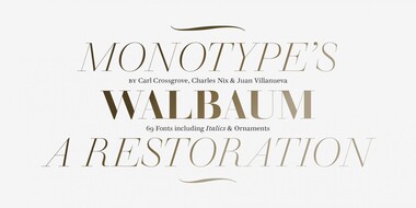
Monotype’s Walbaum typeface is the modern serif font to beat all modern serifs. Freshly restored by Monotype, this updated family oozes charm.
Monotype introduces Ambiguity, a typeface designed to effectively express a range of attitudes and beliefs.
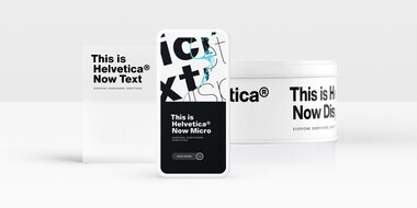
Designers and studios might be deeply familiar with Neue Helvetica, but it’s the product of a pre-digital era. Here are four reasons why it’s time to switch.
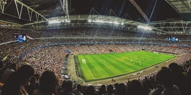
The World Cup is back, and all eyes are zeroed in on the best football … jersey fonts? We examine the tall task of designing for the world of sport.

Monotype designer Terrance Weinzierl delivered a taste of modern Americana to Domino’s, with his modular, multi-weight Pizza Press typeface.

One of the best rebrands of 2016, the new Premier League identity features a typeface that performs confidently from screens and jerseys to TV and league tables.