
Font Legibility
Tired of reporting fonts in a spreadsheet? Watch our webinar introducing License Management, the new feature in Monotype Fonts designed to replace manual spreadsheets with a smarter, streamlined way to manage and track font usage. Hear from Tim Costello, Global Lead IP Counsel, and Jay Loo, Director of Global Pre-Sales and Market Research, as they walk you through how License Management:

Using our Type Tester to pinpoint the perfect font.

Design by trial: Creating meaningful connections in virtual worlds.
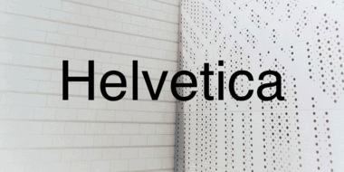
In many ways the idea that Helvetica is a ‘neutral’ typeface has become a self-fulfilling prophecy. That’s not to say it isn’t, but the neutrality narrative is only half the story.

Behind the font highlights the people and process behind the fonts you love and use. This installment features Carl Crossgrove of the Monotype Studio.

Tom Rickner, veteran type designer, shares his personal role in the beginnings of type’s most exciting development in decades.

Consumers are increasingly demanding connectivity in their vehicles, and are prioritizing in-car technology that enhances the driving experience.

With the emergence of variable fonts, design no longer has to be traded for page speed. See how this new technology can transform how we think about web design.
Optical sizing has long been part of the type designer’s toolbox, but for many people the term may not be familiar. Here’s why that should change.

The SST font tackles a central challenge of branding – universality. The SST superfamily supports more than 90 languages including Japanese, Thai and Arabic.
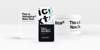
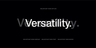
Designers and studios might be deeply familiar with Neue Helvetica, but it’s the product of a pre-digital era. Here are four reasons why it’s time to switch.
As technology raises the stakes for brands, fonts can either level you up or hold you back. A simple, well-organized font system is essential to making sure you can keep pace.
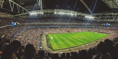
The World Cup is back, and all eyes are zeroed in on the best football … jersey fonts? We examine the tall task of designing for the world of sport.


