
Type resources for designers and brand owners
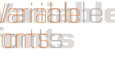
Learn how variable fonts can help brands looking to distinguish themselves in the modern marketplace.
Tom Rickner introduces Monotype’s first Variable font, available free on GitHub, and shares his research into potential use cases for variable fonts.

When screens get smaller, spacing gets tight, details get lost, and forms blend together. The resulting legibility issues can make for a frustrating reading experience. Here’s how to find the fonts that can fix it.

Bob Taylor, Monotype’s Font Technologies Director, offers his views on the promise of Variable Fonts and shares how Monotype and the tech industry are bringing this promise to reality. He shares a few Variable Font tests gone wrong, what we are learning, and introduces the newest Variable Font from Monotype.

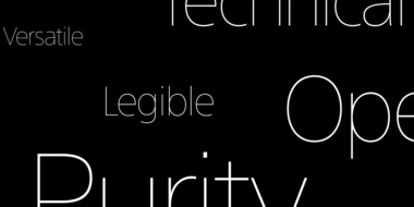
With the emergence of variable fonts, design no longer has to be traded for page speed. See how this new technology can transform how we think about web design.

The SST font tackles a central challenge of branding – universality. The SST superfamily supports more than 90 languages including Japanese, Thai and Arabic.
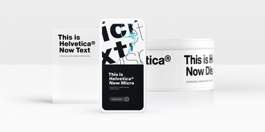
Designers and studios might be deeply familiar with Neue Helvetica, but it’s the product of a pre-digital era. Here are four reasons why it’s time to switch.

The World Cup is back, and all eyes are zeroed in on the best football … jersey fonts? We examine the tall task of designing for the world of sport.
Monotype’s Akira Kobayashi worked closely with Sony’s Chief Art Director Hiroshige Fukuhara to create an original typeface ready for nearly 100 languages.

Monotype and Lippincott worked closely with Southwest Airlines to craft an authentic typographic voice that formed the center of a fresh new identity.
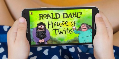
Monotype worked with noted illustrator Sir Quentin Blake and his team to recreate his handwriting as a bespoke typeface.
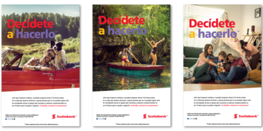
Scotiabank has long used Frutiger as its brand font. But as they expanded to new digital channels and regions, font licensing became too complex. Until now.

One of the best rebrands of 2016, the new Premier League identity features a typeface that performs confidently from screens and jerseys to TV and league tables.


